
Variable Modes and Collections in Webflow
2.4.2025
2.4.2025
Caleb Raney
Webflow recently launched the ability to create variable collections and modes which is a huge boost to the power of variables inside Webflow. In this article we’ll cover what collections and modes are, use cases for using them, and some limitations and other things you might want to know before diving in. If you are still new to variables I’d recommend reading my article on How to best Utilize Variables, which will cover a lot of the basics about why variables are beneficial and how to use them. But lets get into it, what are collections and modes?
What Are They
Collections - improved organization
Collections are basically a folder system for separating variables from each other so that you can have a cleaner view of the variables in your project. When you open the variable panel now all of your collections will be on the left you can easily add more collections, delete them or if you select variables you can move them between collections as well. Note: There will always be one default collection that you can’t delete (but can rename). This is the collection where all new variables created in the style panel will live by default and is also the only collection that doesn’t prepend the collection name to each variable in CSS (but more on that later).
In your typical website some common variable collections could be:
- Utilities
- Color Swatches
- Color Themes
- Typography Primitives
- Typography Styles
- Dynamic Sizes
By itself collections is just a small workflow and organizational improvement but where this turns into a real powerhouse is variable modes.
Modes - dynamic value inheritance
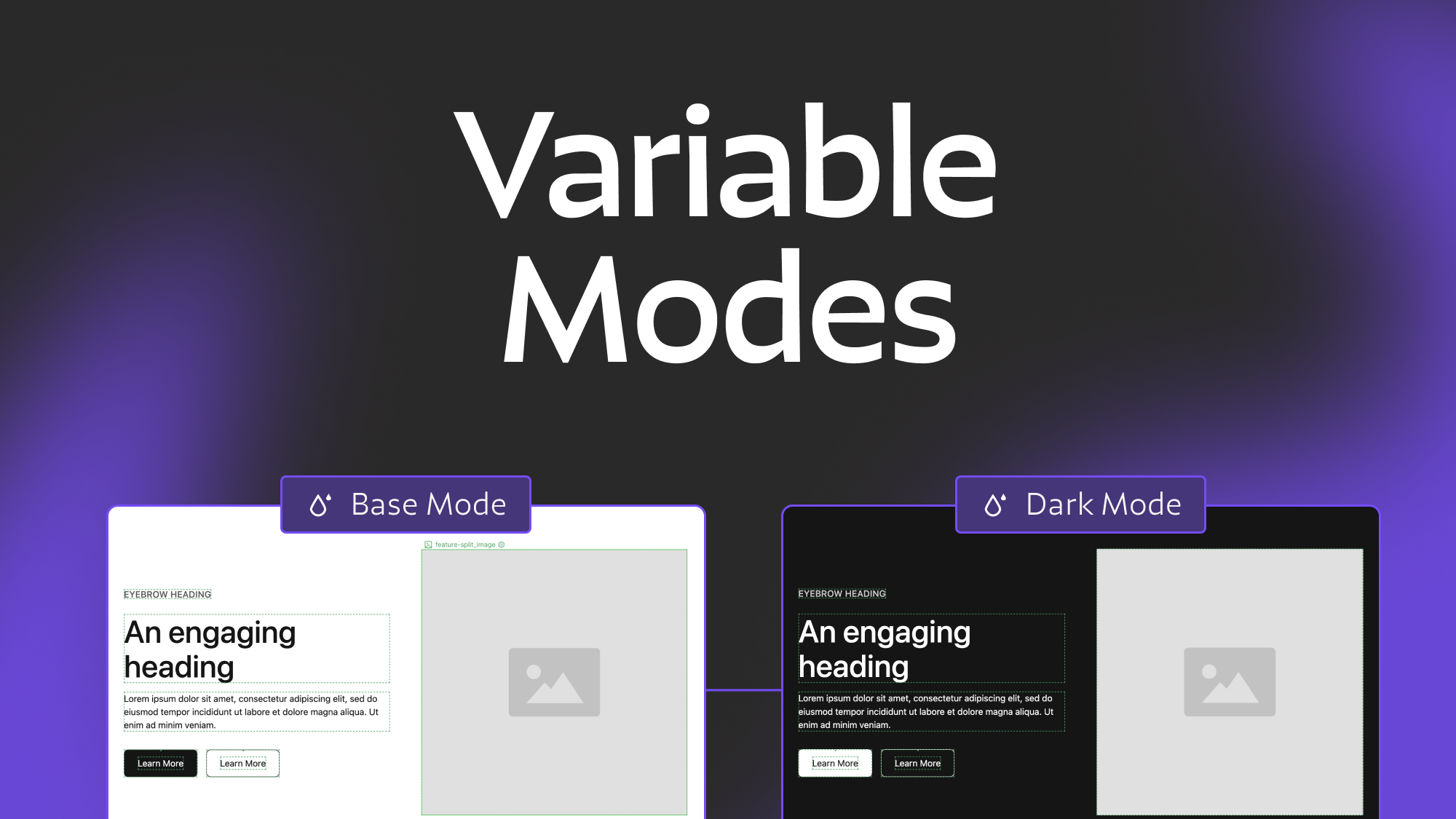
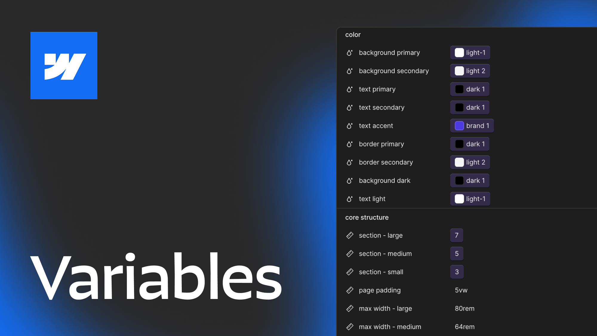
Each collection you create can be given additional modes that allow you to define alternate values for each CSS variable inside that collection, these modes can then be applied to classes in the designer to change which set of values (or mode) that class is referencing. The easiest way to understand this is with an example. Let’s say you want your site to be able to have light and dark theme sections and each of those have a different text, border, and background color. This can now easily be setup as modes where depending on what mode you are in the variables for each of those colors can have a different value. Image below:
There are currently two types of modes that can be created:
- Automatic - will create a mode based on one of the responsive breakpoints in Webflow and will automatically update the value on the body all pages tag for that breakpoint.
- Manual - these are not tied to a specific breakpoint but can be changed on any CSS class.
Automatic is pretty clearly focussed on sizing since that is what you will generally be changing as your site moves into mobile (smaller spacing, typography, etc). While manual is a lot more flexible and can be used in a wide variety of ways. For example, Timothy Ricks shows how you can use variables modes for typography styles, or even alignment to make changing the text and flex direction of elements easier.
Now that we’ve gone through the basics lets get into some good things to keep in mind while using variables and finally we’ll cover the current limitations.
Best Practices
Using Groups vs using Collections
Webflow already allowed you to group similar variables by using a / in the name. So you might be wondering when to use a group vs a collection. Each collection can still have groups within it so there are a wide variety of ways to combine these sorting options. I would start by defining the collections you want in your project and then only use groups within that collection if you’re needing an additional way to organize variables.
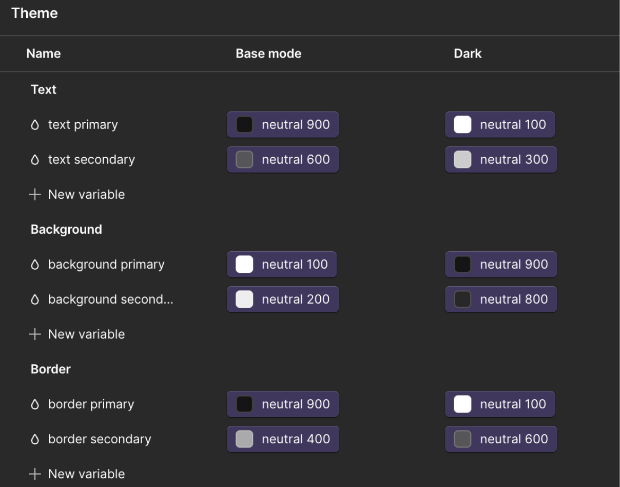
It’s often best to decide on collections based on what modes (if any) that collection will need and what the role of the variables are. Since every variable in a collection gets re-declared in the CSS when you apply a mode to a class in the designer (more on this below) you don’t want to have variables that are irrelevant to that mode inside the collection. A good example of this is color. In most cases you’re going to want a separate collection for primitive and semantic variables. If you don’t know what that means I’d check out my other variables article but a basic understanding is that primitive variables contain the raw values (eg brand-green) and semantic variables define how those values are used (eg text-primary).
Generally you don’t want your primitive values to have modes because they shouldn’t be changing, only your semantic variables will, so put them in different collections (like Color Primitives and Color Themes). Then if you want to further add groups within those collections you can (eg group your brand colors and neutral colors inside your Color primitives collection).
Understand how collections affect variable naming.
Before you jump into your existing sites and start re-organizing your variables its important to know how using collections affects CSS variable names behind the scenes. If your site doesn’t use any custom CSS that references variables then this won’t be relevant for you but it is good to know regardless.
Like CSS classes Webflow allows you to name your variables using Uppercase and spaces but within the actual CSS they will be lowercase with dashes. The variable name will also change depending on if it is in a group or collection. Any collection (other than the default collection) will have the collection name at the front of the variable and then if it is in a group the group name will come second, then finally the variable name.
a “Text Primary” variable inside a “Text” group and a “Theme” collection will be var(--_theme---text--text-primary). So if you use a lot of custom CSS (like I do) the shorter you can make your variable names and the fewer groups you can have the better.
Thankfully webflow allows you to easily copy the CSS variable name within the variables panel so you don’t need to memorize the syntax but if you move a variable into a different collection or group (or just rename it), the backend CSS variable name will change affecting any custom CSS used to target that variable, so its generally best to not rename or move variables around much once you have your project setup.
Variables follow CSS inheritance
If you’re still getting the hang of CSS it can be confusing to know what a variables value is coming from once you start getting modes involved. Variables follow CSS inheritance, meaning that any element will will inherit variable values from their parent elements. This is similar to how something like text colors work. If I set a text color on a div, any div inside that will get the same text color unless they have a class that overrides it. This is what make variables so powerful. All the default variable values will get declared on the :root element and then if you need to override values for specific sections or components you can use modes to change values and it will affect all children inside that element.
Variable modes and style declarations
One thing that can confuse people when first getting into modes is the way that they work with style declarations. For example if your default mode is light mode and you set a section to have a theme of dark mode, the text and background color might not change. This is generally because while the class might be defining the variables they aren’t declaring those style properties. Eg. the text color variable will be set to white but the actual text color is set to inherit so it is pulling from the body’s color rather than that variable value. So if you also set the text and background color to reference the relevant variables the mode should work as expected.
Utility classes and Variable Modes
One other important thing to note is that each time you set a class in webflow to a specific variable mode it is re-declaring all of those variable values under that class which can be a lot of extra CSS. Because of this, it is a good practice to setup utility classes for your variable modes so that you can just add those to elements and keep your CSS size smaller. For example if you create a theme-dark class and then apply a specific variable mode, text color, and background color. You can add that to any element on the page and get the styles you want without making your CSS file larger.
Limitations
As we finish up I’m going to also mention a few limitations of this update, none of them are major but they are good to have in mind as you work with this new set of features.
- Currently you can only have a max of 12 modes per collection. In most cases this won’t be an issue but if you do something like setup type styles as modes then you could potentially run into this limitation if you have more than 12 type styles you want to create.
- From what I could tell there wasn’t a limit on how many collections you can make (I stopped testing after I made 30 because there’s no reason I can think of for creating that many).
- Currently the Figma to Webflow import tool does not support collections or modes. This is something to consider if you have a design system that relies on regularly syncing with figma. Although I’m sure they will try and integrate this down the road.
- Sometimes there can be difficulties when setting up modes that are referencing other mode variables (eg a set of theme modes and brand modes that work interdependently). I haven’t found a situation where this doesn’t work but it can be a little tricky to setup and will require you to declare both theme and brand modes on elements you want to update. Timothy Ricks gets into this a little in his video explanation.
Conclusion
Hopefully this helps you get a sense of how to work with variable modes. To understand this better I’d recommend trying out some frameworks that utilize variable modes to get a sense of what kinds of approaches you can use. Lumos and Mast are both great frameworks and each of them use variables a little differently. I’ve also created a Client-First style starter that utilizes variable modes since the official starter has not been updated in over 2 years at this point (link to that below).
Heading 1 will be longer with text
Heading 2 will be longer with text
Heading 3 will be longer with text
Heading 4 will be longer with text
Heading 5
Heading 6
Lorem ipsum dolor sit amet, consectetur adipiscing elit, sed do eiusmod tempor incididunt ut labore et dolore magna aliqua. Ut enim ad minim veniam, quis nostrud exercitation ullamco laboris nisi ut aliquip ex ea commodo consequat. Duis aute irure dolor in reprehenderit in voluptate velit esse cillum dolore eu fugiat nulla pariatur.
Block quote
Ordered list
- Item 1
- Item 2
- Item 3
Unordered list
- Item A
- Item B
- Item C
Bold text
Emphasis
Superscript
Subscript

Featured Resource:
Client First (With Variable Modes)

Related Posts

Which webflow framework should I use for my project?
Now more than ever there are a lot of amazing Webflow frameworks to choose from but it can be hard to decide which one to use. In this post I explain the approach, pros, and cons of my three favorites (Client-First, MAST, and Lumos) to help you better understand how to decide on which framework to use.
Modular Component Libraries in Webflow
Learn best practices for creating component libraries in Webflow including tips on the new Webflow Slots feature
Webflow class types explained
Ever get confused with some of the terminology for different types of classes? Combo, stacked, global component etc. In this post we dive deep to help you understand the nuances between different types of webflow classes.
Related Posts
How to best utilize Webflow Variables, an in depth guide
This post explores 2 main approaches to using Webflow variables and covers how you can use different layers of variables, strategies for naming, how to approach color systems and more.
Webflow class types explained
Ever get confused with some of the terminology for different types of classes? Combo, stacked, global component etc. In this post we dive deep to help you understand the nuances between different types of webflow classes.
Which webflow framework should I use for my project?
Now more than ever there are a lot of amazing Webflow frameworks to choose from but it can be hard to decide which one to use. In this post I explain the approach, pros, and cons of my three favorites (Client-First, MAST, and Lumos) to help you better understand how to decide on which framework to use.
let's create something


