
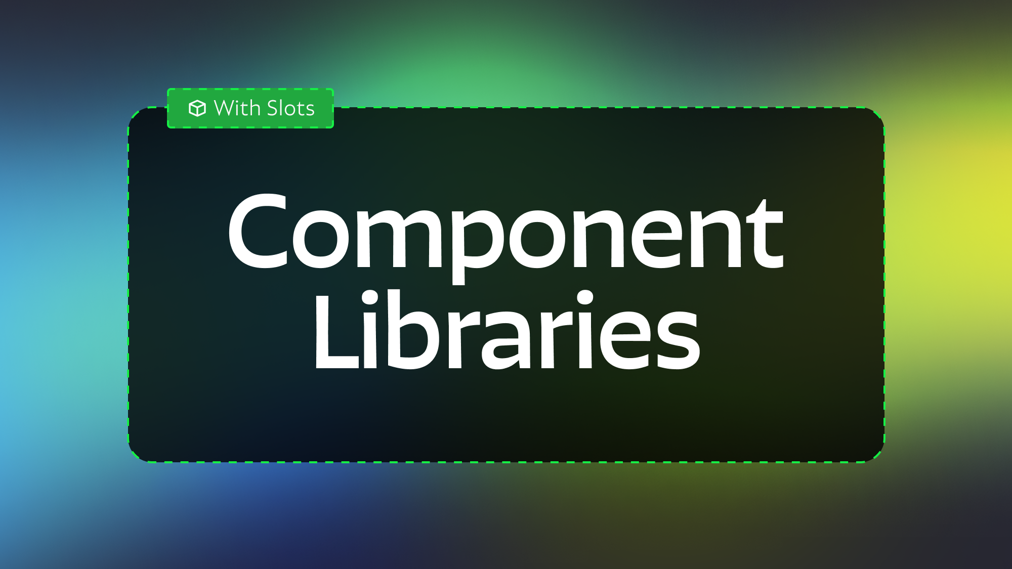
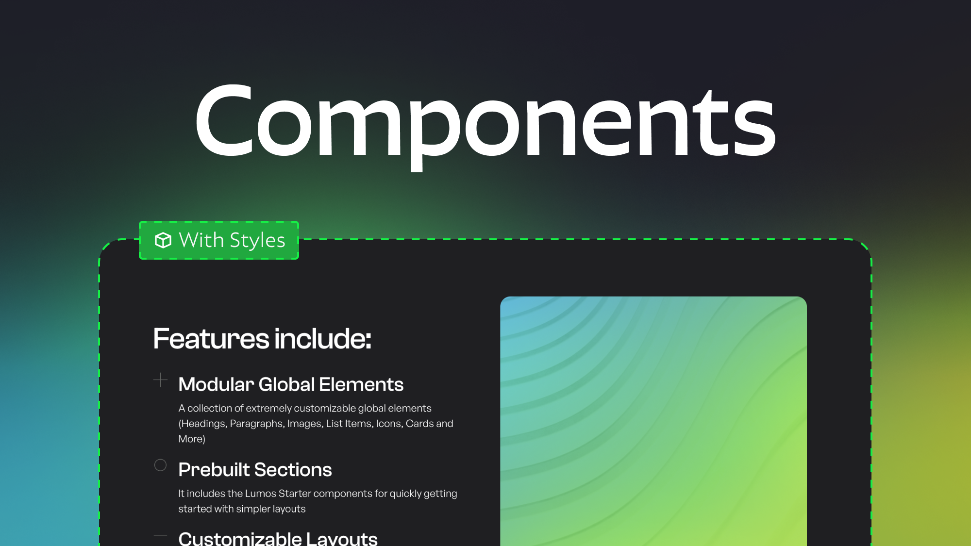
Modular Component Libraries in Webflow
7.19.2024
7.22.2024
Caleb Raney
This post will go into detail on making a component system for your site that utilize Webflow slots to be more modular and customizable. There is also a cloneable linked at the bottom of the post if you want to check out an example of a modular component library.
Utilizing Webflow Slots
On the surface, Webflow component slots might not seem like a game changer, I’ve heard several people take a look and say “I don’t see how this is going to improve things much.” However, it greatly expands the options for kinds of layouts you can create in components. Sections like Galleries, Feature Cards, Buttons with Icons, and more are now both much easier to make, and much more flexible. Previously if you wanted to create a section with 4 feature cards you would need to create a component and manually set individual fields for each card. (Card 1 - Title, Card 1 - Icon, Card 1 - Paragraph, Card 1 - Visibility, Card 2 - Title etc.) This made components in sections like this much more time consuming and finicky. What if a client wanted to add one more card than was currently in the component, too bad.
Now all of these layouts are much easier to make and combined with the ‘style’ properties you can create truly flexible layouts where you can even change grid column amounts or flex alignment in component instances. If you haven’t tried making component style properties check out this post for instruction and best practices.
Current Slot Limitations
Currently component slots have a couple of large limitations that you should be aware of. Firstly, slots cannot have default components set inside them, meaning that if you have a layout with a slot that requires a specific type of content (features layout component with features card components inside) It will be up to users to find and place the right component inside of the slot. (unless they are copy and pasting it from elsewhere on the site). This isn’t a huge deal if you have good documentation, naming, and examples of that layout somewhere with the correct components inside it.
The second limitation is a bit trickier. Component slots cannot be placed inside:
- Link Blocks
- Form Blocks
- Collection Items
- Form Blocks
- Locales Wrappers
- Rich Text
- Search Elements
You can still use components without slots inside most of these but because of this you’ll want to be aware of what components you build slots into. For example - a blog card component that is going to need to be used in CMS items shouldn’t have a slot for the author, instead build that into the component with a visibility toggle if need be.
You can also get around this in some cases with absolute positioning. For example the Lumos framework include a button with an icon slot but includes the link absolutely positioned outside of the element. Although when you’re doing this it is important to keep accessibility best practices in mind. In this Timothy Ricks video he does a good job explaining how to create an accessible card component with both a link and a component slot (start around 25 min in if you want to skip to that part of the video).
Methodologies
One of the larger decisions when creating a component library is how modular you want your library to be. There are two possible methodologies for this:
Flexible Content, Controlled Layouts
With this method you aren’t trying to give component users controls over layouts themselves, simply the content within them. In most cases these components will have 0-2 layers of component nesting. You might have a features section with a slot that has a four column grid inside it. The amount or type of cards can fluctuate but you aren’t letting the user fully re-arrange things; the layout is decided within the component itself. This gives whoever is managing the component library more global control and helps to keep the entire library a little more manageable and consistent since you won’t have as many component properties affecting element styles. On the other hand, if a client wants a component variant with a slight modification that isn’t already included you’ll need to make more components.
Pros:
- More global control from dedicated Webflow developers
- Less likely to have responsive issues
Cons:
- Individual components will have more properties (need to include heading, paragraph, button settings within each layout).
- Less flexible.
- If a client needs a slightly different layout they will likely have to switch components entirely requiring them to re-enter all the property values
Modular everything
In this methodology rather than just creating fully defined layouts with specific content options you are breaking down components into their individual parts. Components will fall into several categories:
- Outer sections with slots (Basic section and container structure)
- Inner layout options (Grid/Flexbox using utility styles)
- Modular Global components (Heading, Paragraph, Button, Image etc..)
In this methodology most layouts will end up with nesting components 3-5 layers deep in order to get the desired result. But on the other hand you won’t need to make as many total components since hypothetically a lot of layouts can be made with fewer components as long as the overall system is well thought out.
Pros:
- Gives component users a lot of flexibility with content
- Breaks down components into individual parts so each component has less properties.
Cons:
- More likely to have user errors.
- More complexity overall and harder to set up.
- Creating full responsive layouts is difficult and it requires component users to understand more about Grid and Flexbox.
Moving forward
Its important to note that you don’t need to pick only one of the methodologies above, you can try to create components that work within both structures but understanding the differences in in these approaches is necessary before getting started.
I’m not going to go into detail on how to set up components with style properties, if you want to learn more about that check out this other post on my site. Instead, I’m going to give tips on things you should consider when building out your component library.
General Tips
Below are a list of the top tips I have when creating component libraries, hopefully these will help you think through various considerations up front so you can think through possible issues before users are working with your library because it is always easier to deal with these things up front.
Name your properties
This should go without saying but naming your properties and setting default values for them is hugely important when it comes to larger component systems. The component properties panel can be very overwhelming when there are 10+ properties within a component so anything you can do to simplify the user experience is important. Make sure you are using /’s to put your component properties into folders. How you name folders is up to you but I’d recommend generally having 2-6 properties per folder.
Create a Component Naming Convention
In order to make components easy to find and place on a page your naming convention is a key part of organizing your library. I would recommend a keyword based naming system where the first name in a component describes what type it is and then following words describe what variant it is separated by a slash or dash. The keyword system I used is below but you can use whatever makes sense to you.
- Global - These are components that are used inside other components or in component slots throughout the site, they are building blocks that can also be used within layout components.
- Section - These are pre-built sections that you can drop onto a page and have specific style controls for, when creating new pages they will help you quickly fill out the pages with prebuilt responsive designs
- Page - These are page related elements like the core structure or custom code that will exist on most pages.
- Layout - These are layouts that include slots for other components, allowing you to have more flexibility in the amount of content included - they are more advanced as they require an understanding of CSS Grid and Flexbox
- Inner - These are components that are made to fit inside component slots, they don't include section structure and are made to give you more control over the amount and type of content within certain layouts.
- Important! - If a component starts with a layout/section name it is meant to only be used in that layout (eg A Feature / Card should only be used within a Section / Feature section
Creating the right amount of options
While this is definitely one of the more abstract and difficult points on this list it is an important area to consider. The more properties you create in a component (especially style properties) the more complex it will be for users to figure out. At the same time, less controls means less flexibility for different kinds of designs.
One area this can manifest itself is in layout options. When creating the Cloneable component library below I wrestled with how many grid options to give the user. Adding in a preset 2, 3, and 4 column grid was easy enough with the lumos utility class system but once you create a more complex grid (like a 12 column grid) you really need to support span, and order properties. The difficulty here is that those properties need to be set on the child elements and adding them to every component that can be used inside a grid adds a lot of bloat into the components and makes the entire system feel more overwhelming. What I chose to do instead was just add them to the Inner Layout components (Grid, Flex, and a special Grid Child Component). This kept all of those more advanced controls seperate from the content components so users who weren't going to be creating more 'complex' layouts don't need to worry about them, but if you want to make something more custom with a 12-column grid the controls are there. In your projects you might decide the added CSS and complexity of supporting a 12-column grid isn't worth it and those kinds of layouts should really be built by a webflow developer and turned into a distinct section component. That is a totally valid approach, I decided to show off what you could do with more layout options but that doesn't mean this is the right way to do things for your website or client.
As a part of deciding when to add in new options it can be helpful to consider how often those properties will realistically be used to figure out where you can simplify things. For example, if you're creating a layout with a 12 column grid you will very consistently need to modify the amount of columns a child spans, but I decided to not give options for the amount of rows, because that was not necessary in most cases (or could be worked around with grids inside grids). This reduces the amount of properties I added to each inner element, along with the Custom CSS and additional html it would end up adding by having those attributes within every component.
Documentation is key
I would recommend having a separate component page from your style guide that includes instructions on naming, how to use components and a list of components on your site. Because component slots currently have default components within them this will allow users to see how components with slots should be used and easily copy and paste those sections to other pages.
It is also important to help people understand what values they can and can’t use when working with style properties in a component.
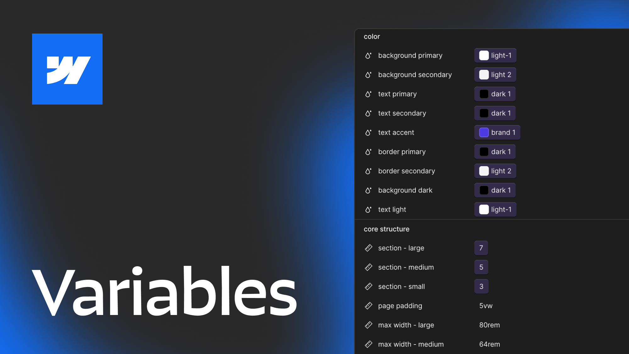
Utilize variables
You want to avoid hardcoding style values in custom CSS whenever possible, so the more you can take advantage of Webflow variables the easier it will be for you to make updates to the entire component library without even entering a component. If you aren’t sure where to start with Webflow variables check out this post. This is especially true for anything related to color, typography, and core structure (container max widths, etc).
Pick your framework
It is also important to note that depending on what framework you use each of them will work a little differently with components. What utility classes they offer will change and some come with built in attribute support for certain variables. When working with components the framework I’ve found that gives you the most built in control is Lumos, but if you’re curious about other frameworks I have a blog post comparing the most popular webflow frameworks out there and describing their pros and cons.
Regular vs Rich Text
When creating components it is important to think about where you want to use regular vs rich text. Rich text can give you a lot of advantages because you can modify heading tags, bold, and italicize, or insert text links. But the downside is that rich text fields can’t be bound to CMS plain text fields. You can also include both options with visibility toggles to have the best of both worlds but that does add more controls to your components that does increase the learning curve. Whetever you decide make sure to think it through up front. You don’t want to have a layout component used 20+ places on the site and then have an instance where the client needs to add a link to the paragraph and you didn’t account for that.
When using rich text fields it can be helpful to clear out the default styles that is in rich text so you can modify the class and visual style of a heading regardless of the tag it is using.
Just because you can doesn’t mean that you should
In the cloneable below I was trying to see what all is possible with Webflow components and trying out more modular layouts, that being said I wouldn’t necessarily take this approach for all client projects. The goal of components is not to replace standard elements, but to allow you to create consistency within your website and retain global controls while also letting clients build new pages in a more controlled environment. Take into account who is going to be using the components you create when you are building your library so that you can provide the right level of control for their abilities.
Heading 1 will be longer with text
Heading 2 will be longer with text
Heading 3 will be longer with text
Heading 4 will be longer with text
Heading 5
Heading 6
Lorem ipsum dolor sit amet, consectetur adipiscing elit, sed do eiusmod tempor incididunt ut labore et dolore magna aliqua. Ut enim ad minim veniam, quis nostrud exercitation ullamco laboris nisi ut aliquip ex ea commodo consequat. Duis aute irure dolor in reprehenderit in voluptate velit esse cillum dolore eu fugiat nulla pariatur.
Block quote
Ordered list
- Item 1
- Item 2
- Item 3
Unordered list
- Item A
- Item B
- Item C
Bold text
Emphasis
Superscript
Subscript

Featured Resource:
Modular Component Library
Related Posts

Which webflow framework should I use for my project?
Now more than ever there are a lot of amazing Webflow frameworks to choose from but it can be hard to decide which one to use. In this post I explain the approach, pros, and cons of my three favorites (Client-First, MAST, and Lumos) to help you better understand how to decide on which framework to use.
Variable Modes and Collections in Webflow
An in depth explanation of Webflow's new variable modes feature
Webflow class types explained
Ever get confused with some of the terminology for different types of classes? Combo, stacked, global component etc. In this post we dive deep to help you understand the nuances between different types of webflow classes.
Related Posts
How to make components with style controls in Webflow
Learn how to change layouts, colors, and more within single components using visibility overrides and a bit of custom CSS.
Which webflow framework should I use for my project?
Now more than ever there are a lot of amazing Webflow frameworks to choose from but it can be hard to decide which one to use. In this post I explain the approach, pros, and cons of my three favorites (Client-First, MAST, and Lumos) to help you better understand how to decide on which framework to use.
How to best utilize Webflow Variables, an in depth guide
This post explores 2 main approaches to using Webflow variables and covers how you can use different layers of variables, strategies for naming, how to approach color systems and more.
let's create something


