
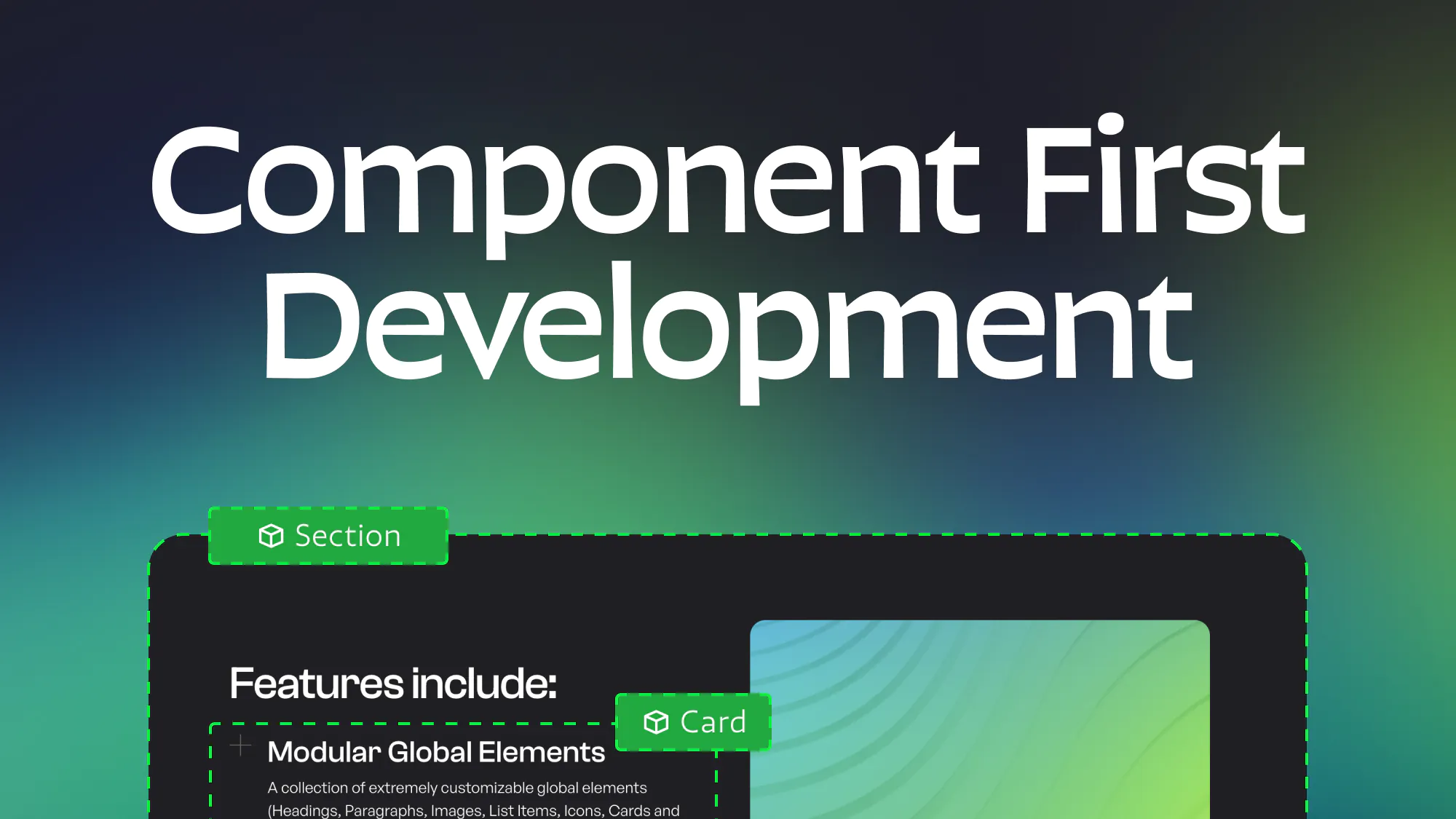
The rise of component first development in Webflow
3.25.2025
3.25.2025
Caleb Raney
As Webflow has evolved over the past couple of years components have gotten much more powerful. With this change there has been a significant shift in the mindset and process for creating Webflow sites that is much more focussed on building around components whenever possible. In this post I’ll explain what component first development is, why it is beneficial, some of the considerations around it, and how to develop with this methodology.
So what is component first development?
This is where you try to structure a site so that every single section and the content inside it is built with components. One of the main reasons you need to turn everything into components (and not just your most common sections) is that Webflow currently limits a lot of functionality in Build mode to only affect components that are inside of a page slot element (which cannot contain anything that isn’t a component). Because of this, in order to give non-developer team members the ability to fully edit and build pages you need to use components for everything. Note that there are still some limitations that can prevent you from making components (especially when it comes to CMS elements) that I will discuss a little later on.
Benefits
Greater Build mode flexibility
The main benefit of this approach is that it gives users much more power to edit and create pages directly from build mode. Let’s be real, Webflow is a very difficult tool to understand and use well and most clients (or team members) who aren’t developers are going to end up making mistakes that undermine the structural integrity of the site. Whether that is not naming new classes, accidentally adding styles to a global utility, or building whole pages while completely ignoring the framework your site is using. It’s not realistic to expect people whose primary job is not building in webflow to understand the complexities of the platform.
However, with component first development you can give these users a huge amount of control without making the site disorganized and bloating your CSS. They can build new pages with any existing section design, update any content, and if your library supports it, even change color themes and basic styles like text alignment or section spacing. All of this is incredibly helpful in speeding up your team and improving the rate at which you can scale your site.
A cleaner and more robust design system
Another interrelated benefit of using a component system is you can keep your site’s CSS much cleaner and more efficient. Rather than having teammates mess around in design mode and create unnecessary classes because they don’t understand your framework, they can just drop a component onto the page and utilize style properties to have a specific set of variations that are supported within your design system. This leads to better design with more consistent spacing, color, and typography, and also a cleaner webflow designer environment.
Key Considerations
Okay, so now you’re sold on component first development, but before going all in on it there are a few important considerations to discuss.
Components vs CMS
One of the main difficulties with component systems in their current state is integrating them with Webflow CMS collections. While you can do this to a certain extent today there are a few main limitations that are important to know beforehand.
1. Can’t bind component visibility to CMS conditional visibility.
What this means is that you cannot have certain elements of a component show or hide based on if a field is filled out in the CMS collection. For simple text blocks this might not be an issue, but imagine you have a component with an image inside of a wrapper div and you want to be able to hide the wrapper if that image is not set in the CMS. In this situation you can setup the component with a visibility property but there’s no way to bind that property to whether the CMS image field is filled out or not.
You can get around this to a certain extent by creating a toggle field in the CMS and binding that to the visibility property, but this can really bloat the CMS depending on how much you are using this workaround.
Ultimately, in many cases you’re going to find that you’ll need to unbind some components on CMS template pages in order to make more use of conditional visibility, but if you can limit this to the template pages and find workarounds for the rest of the site you’ll still be able to create a robust component system.
2. No Nested CMS collections in components
You can’t place any nested collection lists inside a component. Because of this any sort of complex tagging system isn’t going to work within components and will be another instance where you’re going to need to unlink components and forego usage of a page wrapper.
3. Can’t bind filter or sorting options to component properties
The last main limitation when it comes to CMS is that you cannot setup properties for filtering or sorting of collection lists. You can get around this by duplicating the component and modifying those CMS settings on the new component, but at a certain point this can really bloat your component library.
At the end of the day Components and CMS still have a bit of a push and pull relationship that isn’t fully harmonious. Depending on the needs of your site you will have to make some decisions on what to prioritize and where to make some concessions.
Ultimately I don’t think that these issues remove the benefits from building with a component first mindset, but they do mean that on more CMS reliant sites you won’t get quite as much benefit out of the component system and will not be able to use page slots as much. That being said they will still be incredibly valuable for static sections and building out new landing pages.
Modular vs Fixed Components
Before getting diving in and building out your component system you’ll want to decide on your approach regarding modular vs fixed components. while there is definitely a gradient between these two approaches they are somewhat distinct and each has their own advantages and difficulties.
Fixed Components
This method focuses on creating content rich section components with more limited design options. In most cases when building a new page you will only have two layers of components that users in build mode are using to create pages:
- Sections - Any top level component (most will contain a heading, paragraph, image, and potentially a slot for cards)
- Cards - Any component nested into a section component (card designs, faq items, gallery images)
Note: you will often have more nested components (like buttons, global content, global grids) but these won’t be directly added by anyone in build mode since they are pre-built into each section or card and have their properties exposed to the parent component.
By building out the system in this way there are several main advantages.
- More control over your design system - This gives designers and developers the ability to put more specific limitations on what combinations of elements are possible and ensure that all the designs on your site are consistent and cohesive.
- Mobile responsiveness - as a developer you can ensure that each component is responsive because you aren’t giving as much power to component users to define things like how many columns a grid item spans.
- More complex layouts - with this system you can use all the layout power of webflow while not over-complicating things for users in build mode, creating really dynamic layouts while just exposing the specific properties you want builders to be able to edit.
- Building pages is faster and easier - Because the layouts are already setup this allows someone to easily drag and drop components onto a new page and get it setup quickly without having to nest as many components.
Modular Components
This system breaks down layouts into their individual parts allowing you to create sections from scratch by nesting a bunch of different components together and customizing their position. These systems will often have individual components for each of the following items:
- Section - basic section structure
- Row/Container - a layout that allows you to set a column count.
- Column - a child layout that allows you to define the specific column span and can hold content
- Heading
- Paragraph
- Image
- Button
With this setup each component will have fewer properties but you will need to have more nested layers and setup control for responsive breakpoints (like column width and order, or visibility for smaller breakpoints). This setup has a bunch of unique advantages when compared with fixed components:
- More Content Flexibility - Because every piece of content isn’t already built out into a component you have much more control over content in each layout. If a section needs three buttons, or you want another heading underneath a paragraph just drop one in, no sweat.
- Faster setup - While this type of system needs a pretty robust plan when you first set it up so that you are creating all the responsive options you need, once your basic components are created you’re good to go. You spend a lot less time creating variants of components because its all up to the user to combine them in a way that works for their needs.
- Smaller library - by using less components you will generally have a smaller CSS file size and have an easier time of making sitewide updates to an individual component (maybe headings need a max width property and you can add that once rather than in each section).
At the end of the day whether you go for a modular library or fixed library (or try to do both) is totally up to you and your team. I’d recommend thinking about the skill level of who is going to be primarily using your components along with how they fit into the framework you are using eg (Lumos tends to use a fixed component library and MAST utilizes a modular library).
How to develop with a component first mindset
Now that we’ve talked through the things to consider before getting started let’s dive into the details what should you do if you want to start using components more.
Note, that since I use a Fixed Component setup not all of this advice will apply to a modular component library, but some of it will definitely carry over.
Pick a framework
I have another blog post where I discuss this in more detail but I’d definitely recommend starting with a framework that has a component system started for you. This won’t cover all your needs but it will give you a head start and having a set of utility classes built in will give you a lot more control over your components down the road. I’d recommend Lumos or MAST if you’re wanting to build more robust component systems but you can also do this with Client-First (or any other framework), you’ll just need to build more things out on your own.
Bulk up your starter file
If you’re an in-house team this will look a bit different and you might want to focus on creating a shared Webflow library rather than a starter file but as a freelancer or an agency a high quality starter will make your life so much easier. As someone that builds a lot of new webflow sites, having a starter file with a bunch of common layouts already build out as components saves me a lot of time when working on new builds.
Because you can’t paste a component and keep its properties setup (even when using tools like Relume) copying and pasting other webflow sections is a lot less valuable than it used to be. In my experience if I have a component setup and all of the properties named and bound, and all of the classes named it is much faster to make some changes to the layout than to start with the exact layout I want and have to then create a component where I need to create all the properties from scratch.
Because of this my starter has a lot of basic components already setup and named and I’ll just go in and make updates to the layout of each one afterwards rather than starting from scratch. I’ve found this speeds up my process a lot and lets me deliver even more components for my client to use even if not all of them were in the original design. What components you build will depend on whether you went for a modular or fixed component library and what types of clients you serve but for me having the following components setup has been a boost to setup speed for my fixed component library.
- Basic Header
- Left/Right Split layout
- Logos Section
- Testimonial Section
- FAQ (section and items)
- CTA Section
- Cards Section (allows choosing between different column counts for the slot or using an autofit grid)
- Basic Card (heading, text, image, button)
- Blog Card
- Icon Card
- Gallery Card
While its not a huge amount of components I know I’ll use most of these on every site I build, and I’m sure this list will grow over time.
For a modular framework you’ll most likely be able to setup all the main components you need before starting on your build, I’d recommend creating a few different card types and also having a page where you lay out your modular components in a lot of common layouts in order to allow you to more easily copy and paste those as you build out your site.
Setup your variables
Components and variables work hand in hand to create a cohesive design system, if you picked a solid framework it should have most of the variables you need already but it’s worth mentioning that having these re-usable values setup in an editable way will make updating your design system much easier down the road. If you want to learn more about setting up variables check out this post.
Start Small
When building out a component library its important to consider the basic building blocks and start with those. Setup your buttons, section spacer, cards, and generic content groups (eg eyebrow, heading, paragraph, two buttons) so that you can make updates to those globally down the road.
Naming Components
From an organizational standpoint its also incredibly helpful to name and group components using a consistent naming convention. I tend to start off all sections with a "Section / " followed by a keyword like CTA or Feature, and then if you have multiple types of those components follow it up with the name of that specific variant (also separated by a slash).
I'd also recommend setting up groups for your components in the components sidebar, you can start each group with a number in order to have the ones you're using most show up at the top. The amount of groups you need will depend on the size of your library but I'd recommend something like the following to get started:
- Sections
- Cards/Slot Elements
- UI Elements
- Page Structure
- Miscellaneous
You can also add groups for icons, global components, internal structural components or further divide them by type of section or card.
Setting up properties
As you turn layouts into components you’ll need to setup properties in a way that is consistent and user friendly. Make sure that you are grouping properties if your component has more than 6 or so properties. For fixed component systems often you’ll want a property for the visibility of each piece of content, the content itself, and then any specific styles for that content eg:
- Heading/Heading Visibility
- Heading/Heading Text
- Heading/Heading Tag (if it isn’t a rich text heading)
- Heading/Heading Class
- Heading/Heading Max Width
Notice that all those properties are within a group to make it clearer for the user to navigate, I also tend to group properties for content in the order they appear in (top to bottom) with a separate group for section styles at the top.
Style properties
An important aspect of any component library is giving users the ability to modify styles within your component. This drastically reduces the amount of total components you need and speeds up the process of building and editing pages.
You can create style properties for a component in four ways:
- Data attributes
- Classes
- Inline Styles
- Component Variants
If you don’t know how to use the first three ways I’d recommend checking out this blog post where I explain them (note, it was written before component variants were released and needs an update to include that).
While component variants are ideal from a user experience standpoint (because they give a clear set of options for each property in a dropdown menu) you cannot have multiple style properties within a component without nesting components (more on this below). Because of this it is still important to utilize these other options for style properties. The most common one you’ll use is the class selector because it is incredibly flexible and will most likely have built in documentation on your style guide page. One common example of this is a heading style class to allow users to change what a heading looks like independent of its tag.
The key here is giving the user the options they need to update a component visually without overwhelming them with too many properties. For section styles I default to top and bottom padding (these are nested components so they each have a variant dropdown), a class for the color theme, and potentially another variant for that components layout (eg left vs right alignment).
Setting good defaults
This is especially important when it comes to style properties but is also the case with content to an extent. I’d make sure to set the defaults for each section so that they reflect the most common value that property will need eg, make sure your CTA buttons are linking to the contact page so someone doesn’t need to change the value and text for that each time. When you nest properties you can give them unique defaults so make sure to utilize these to speed up your build as you go. Changing defaults can also be a great way to update a bunch of components at once if you know that most of them are using the default value.
Advanced tips
Here are a few advanced techniques you can use to make even more powerful components
Nested component slots
One key trick to creating more powerful components is by nesting them inside each other (even inside a fixed component system). By doing this you can use the component variant property to give the user a clearer sense of what their options are, and you can also more easily update a lot of components at once if they share the same nested component.
One important trick when doing this is putting slots inside of slots. For example if I have a global grid component I want to use to manage cards then I can put that inside several different sections to give them all the same grid options. The trick to this is that in order to be able to add cards to that grid I need to drop a slot into the grid components slot and give it a custom css value of display: contents; This will allow any cards I drop into that section slot to act as if they are directly inside the grid component and ignore the parent div in between.
This is something easier shown than explained so I’d recommend watching this timothy ricks video to understand it better.
Attribute based Javascript interactions
One other trick I’ve been using is setting up global GSAP interactions that target data attributes. This allows me to setup specific interactions that trigger on scrollin or load for headings, paragraphs, images, and more. Each of these will work automatically within every component I drop onto the page. I have also built in the ability to use another data attribute to disable those interactions on a specific component, that way if I want any components or specific pages to not have interactions I can turn them off.
I’m sure you could also accomplish something similar by using native webflow interactions that are triggered on specific classes. While I’m guessing it wouldn’t be quite as performant or accessible that’s definitely an option if you aren’t confident writing custom javascript.
Wrapping up
I hope this article helped you see the value on building sites with a component-first mindset, and gave you some tools to start building more advanced component libraries. If you found this helpful feel free to check me out on Twitter where I post more about Webflow.
Heading 1 will be longer with text
Heading 2 will be longer with text
Heading 3 will be longer with text
Heading 4 will be longer with text
Heading 5
Heading 6
Lorem ipsum dolor sit amet, consectetur adipiscing elit, sed do eiusmod tempor incididunt ut labore et dolore magna aliqua. Ut enim ad minim veniam, quis nostrud exercitation ullamco laboris nisi ut aliquip ex ea commodo consequat. Duis aute irure dolor in reprehenderit in voluptate velit esse cillum dolore eu fugiat nulla pariatur.
Block quote
Ordered list
- Item 1
- Item 2
- Item 3
Unordered list
- Item A
- Item B
- Item C
Bold text
Emphasis
Superscript
Subscript

Featured Resource:

Related Posts

Which webflow framework should I use for my project?
Now more than ever there are a lot of amazing Webflow frameworks to choose from but it can be hard to decide which one to use. In this post I explain the approach, pros, and cons of my three favorites (Client-First, MAST, and Lumos) to help you better understand how to decide on which framework to use.
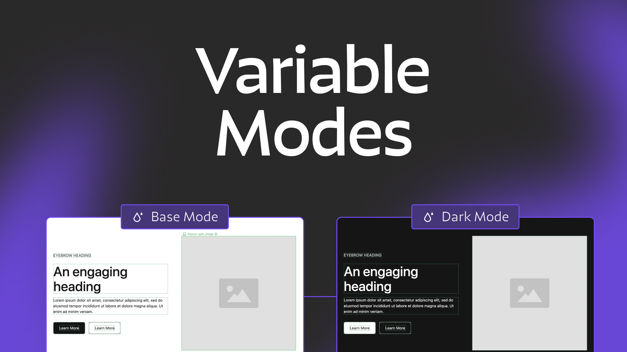
Variable Modes and Collections in Webflow
An in depth explanation of Webflow's new variable modes feature
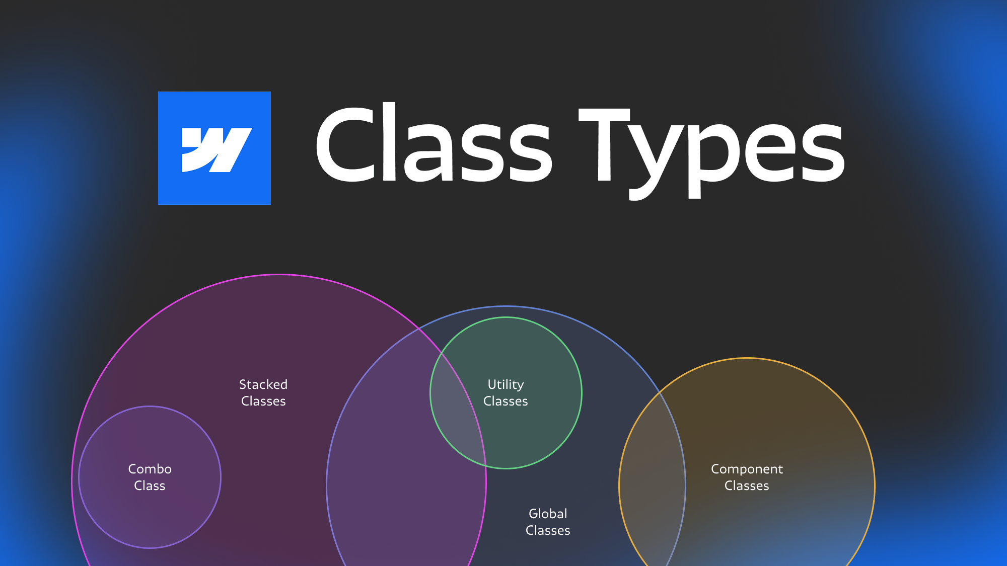
Webflow class types explained
Ever get confused with some of the terminology for different types of classes? Combo, stacked, global component etc. In this post we dive deep to help you understand the nuances between different types of webflow classes.
Related Posts

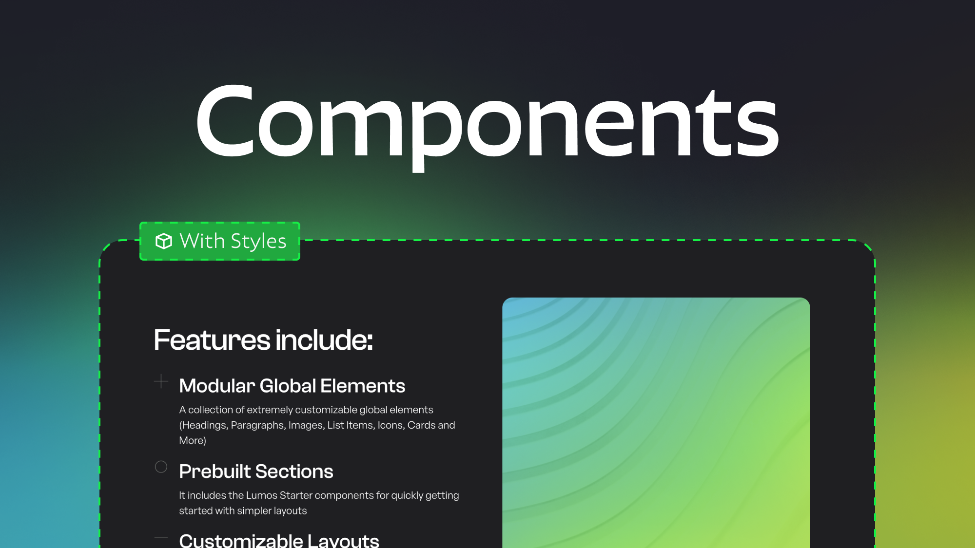
Modular Component Libraries in Webflow
Learn best practices for creating component libraries in Webflow including tips on the new Webflow Slots feature
Which webflow framework should I use for my project?
Now more than ever there are a lot of amazing Webflow frameworks to choose from but it can be hard to decide which one to use. In this post I explain the approach, pros, and cons of my three favorites (Client-First, MAST, and Lumos) to help you better understand how to decide on which framework to use.
How to make components with style controls in Webflow
Learn how to change layouts, colors, and more within single components using visibility overrides and a bit of custom CSS.
let's create something


